
Functional Prototype of an Analytical Platform for an Airline
The airline company was working to improve its analytics and business practices related to engine repairs. The solution designed by BCG is expected to save $100 million for the client. The top-tier consulting firm was looking for a designer to assist in creating a prototype based on the POC model. ** To comply with my non-disclosure agreement, I have omitted and obfuscated confidential information in this case study. All information in this case study is my own.
MVP
Web App
B2B
Dashboard Design

I was the sole UX designer on an Agile team comprised of 2 developers from Toptal, BCG’s data scientists, project managers and an information architect. I was responsible for determining the overall design direction of the project.
Jan 2022 – May 2022
Create UX/UI work plan with a timeline, define product requirements and deliver a high-fidelity clickable prototype based on BCG's proof of concept model.
The project began with an in-depth study of airline maintenance and repair operations, followed by interviews with key users to understand their workflows and uncover pain points. Working closely with data scientists, developers, and the information architect, I mapped user flows and created dashboard wireframes, which evolved into a functional prototype built in Webflow. Despite limited access to real data and users, I used creative problem-solving and low-code tools to deliver an interactive, data-driven interface that supported faster and more efficient decision-making.
1. The biggest challenge was to learn the industry, the aircraft maintenance and repair process quickly. Learn about the MRO to understand the users.
2. Second challenge was to work with data. As an outside contractor, working remotely, I couldn’t have access to real databases and had to be very creative to overcome this circumstances. At some points I had to emulate data and sometimes create new databases with obfuscated data.
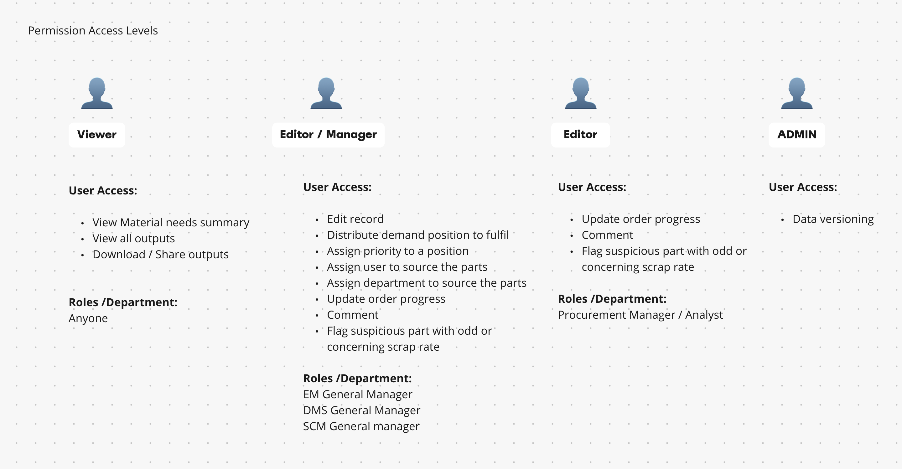
3. Another difficulty was access to the users. As a subcontractor, I couldn’t talk to the users directly or in confidence. It was very difficult to establish safe trusting relationships. I had very little time with users because they are very busy high -level management. Majority of the potential users were very frustrated about the current work process.
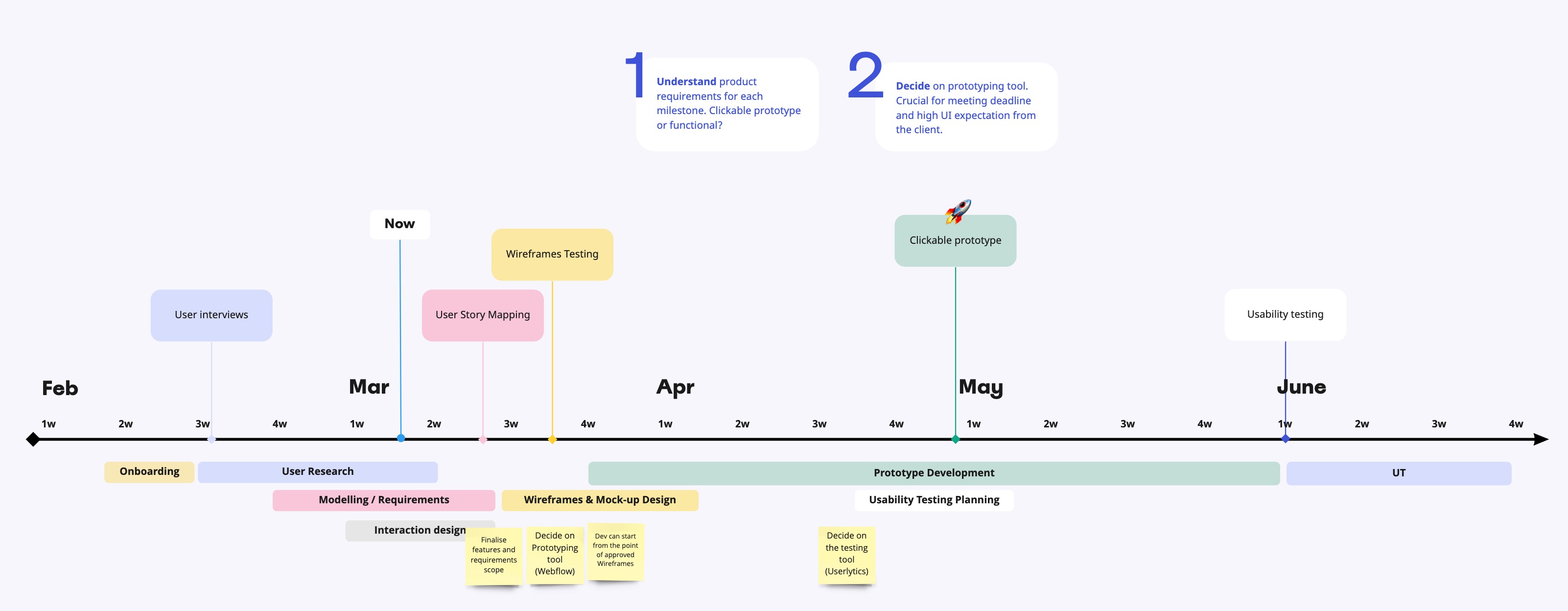
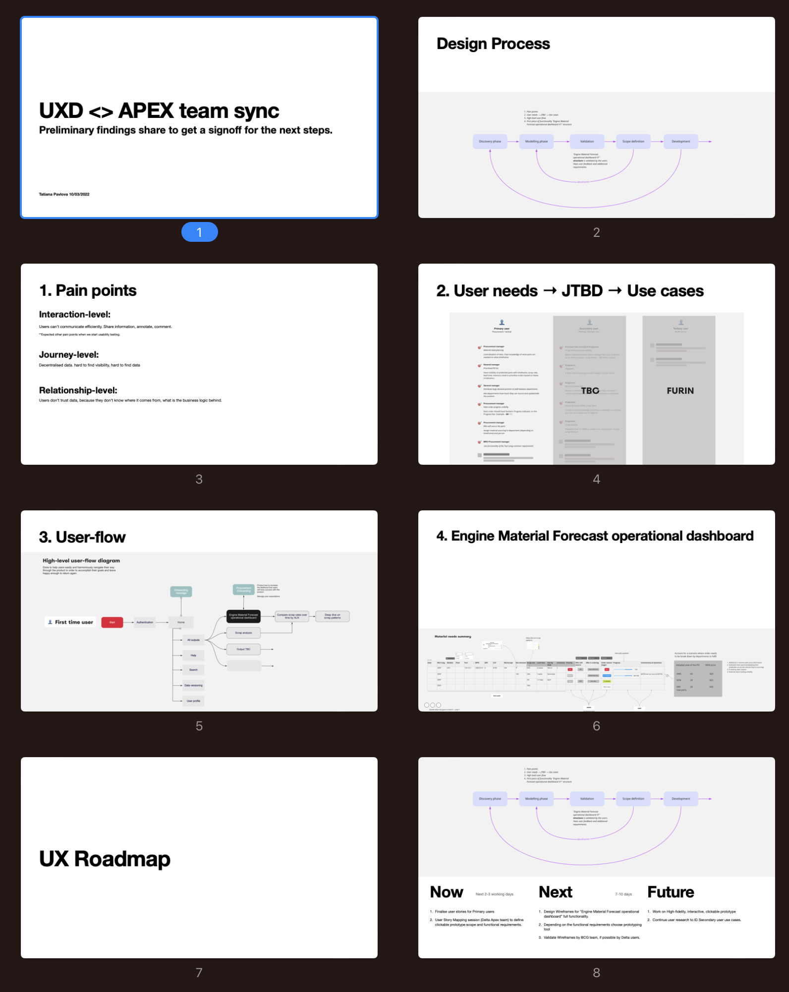
I was asked to create UX/UI workplan with timeline based on deadline for deliverables. The plan consisted of 5 phases:
The airline industry is a pretty technical field and I had to read a lot of documentation and learn the MRO (Maintenance, Repair, and Overhaul) process before the user interviews. My team shared background knowledge and brought me up to speed on the work. I had to learn 50 acronims to be able to understand related documentation and start to have a conversation with the users.
After couples of interviews I realised that the more productive approach will be to launch a survey to identify user groups and see where use cases overlap first. After designing and presenting the experiment to the management at the last moment it was decided not to proceed with the survey. Client wasn’t comfortable with user-centric approach and wanted to reduce user input at this stage to meet deadlines.
I carried on with the user interviews managing to talk with 10 key users.
As a result we found pain points on Interaction, journey and relationship levels.

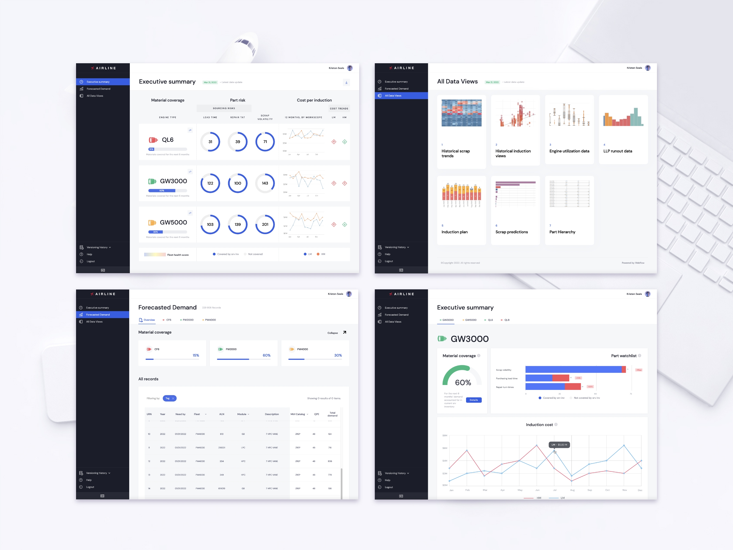
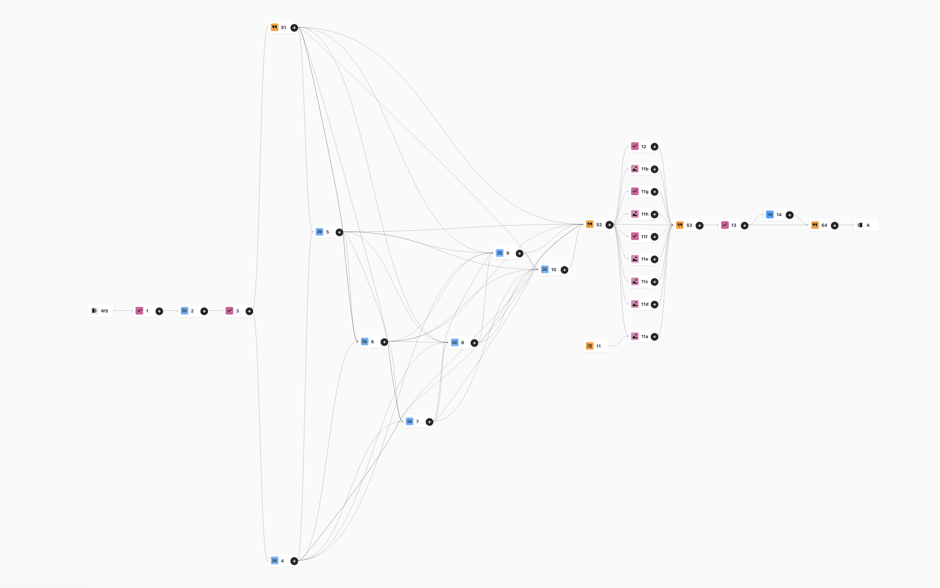
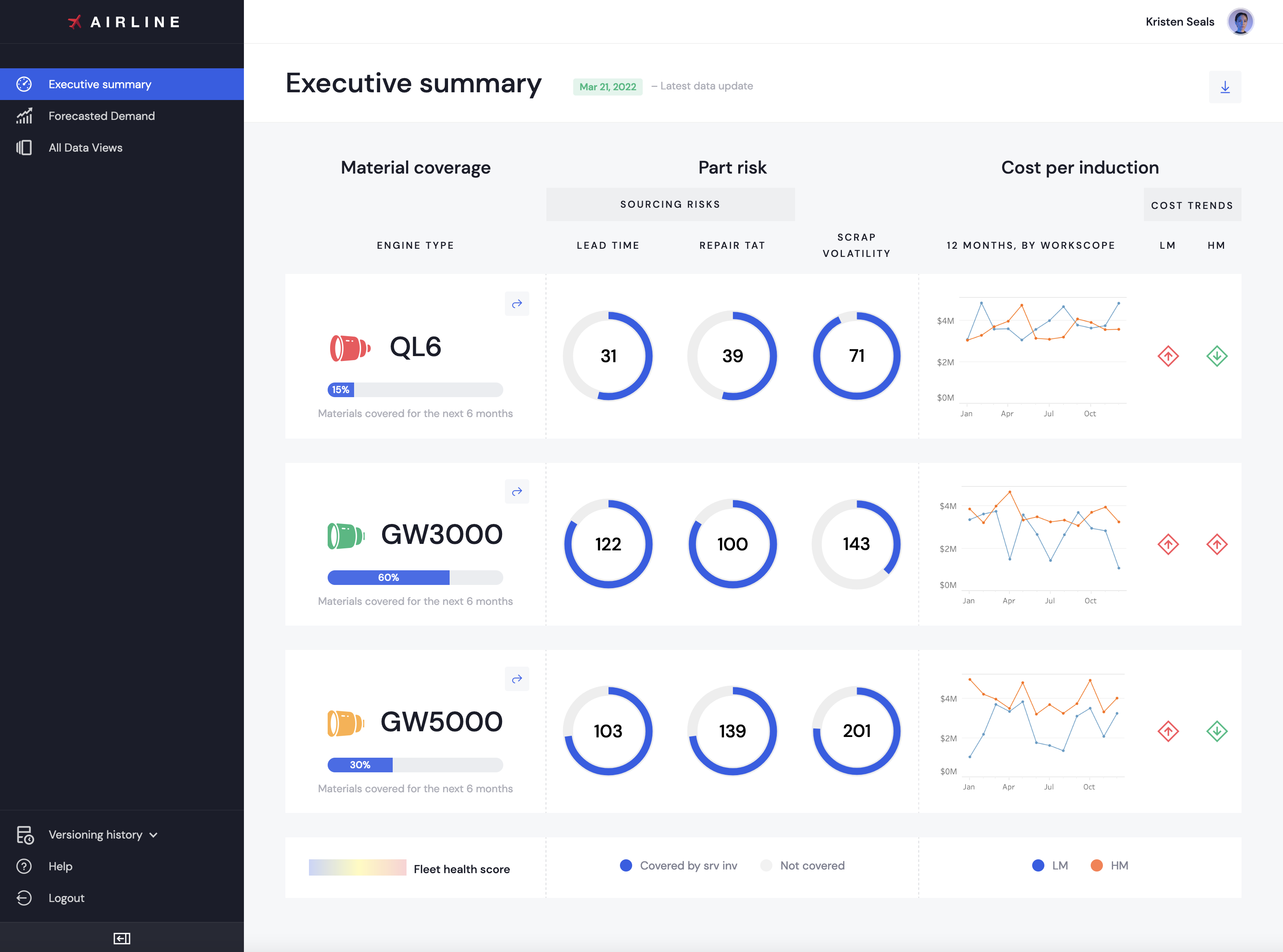
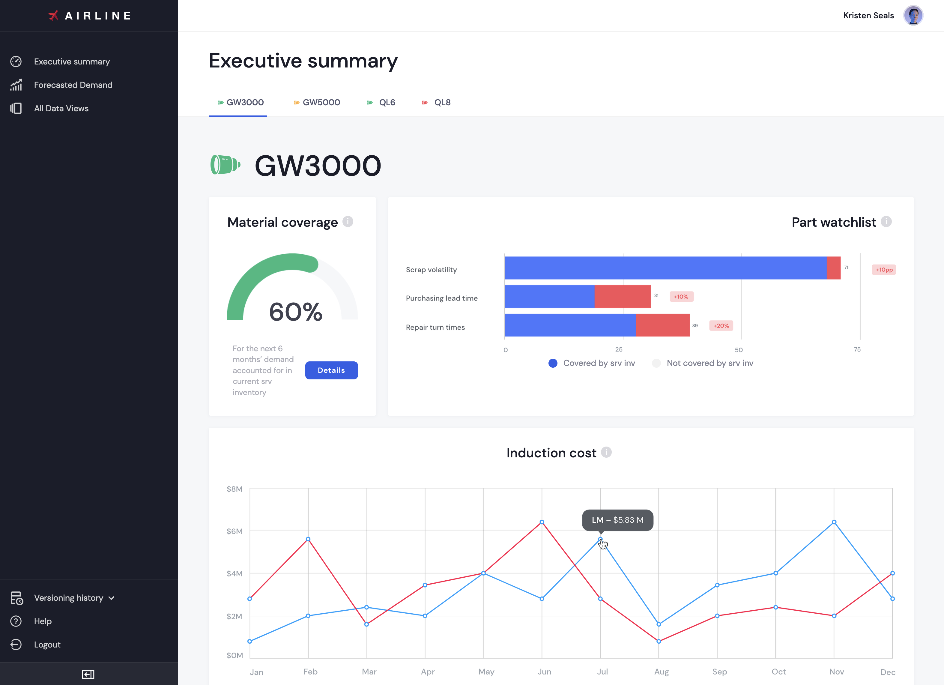
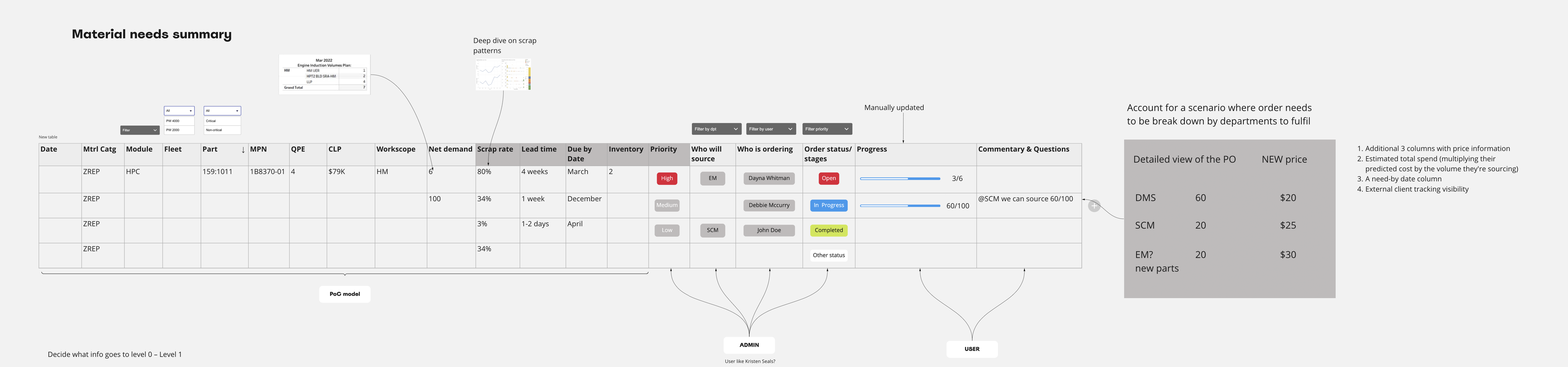
To progress with my design I created wireframes and user flow map while talking to the users and analysing my findings. With data scientists, architect, key users and developers we modelled high-level user flow map and potential dashboard design.


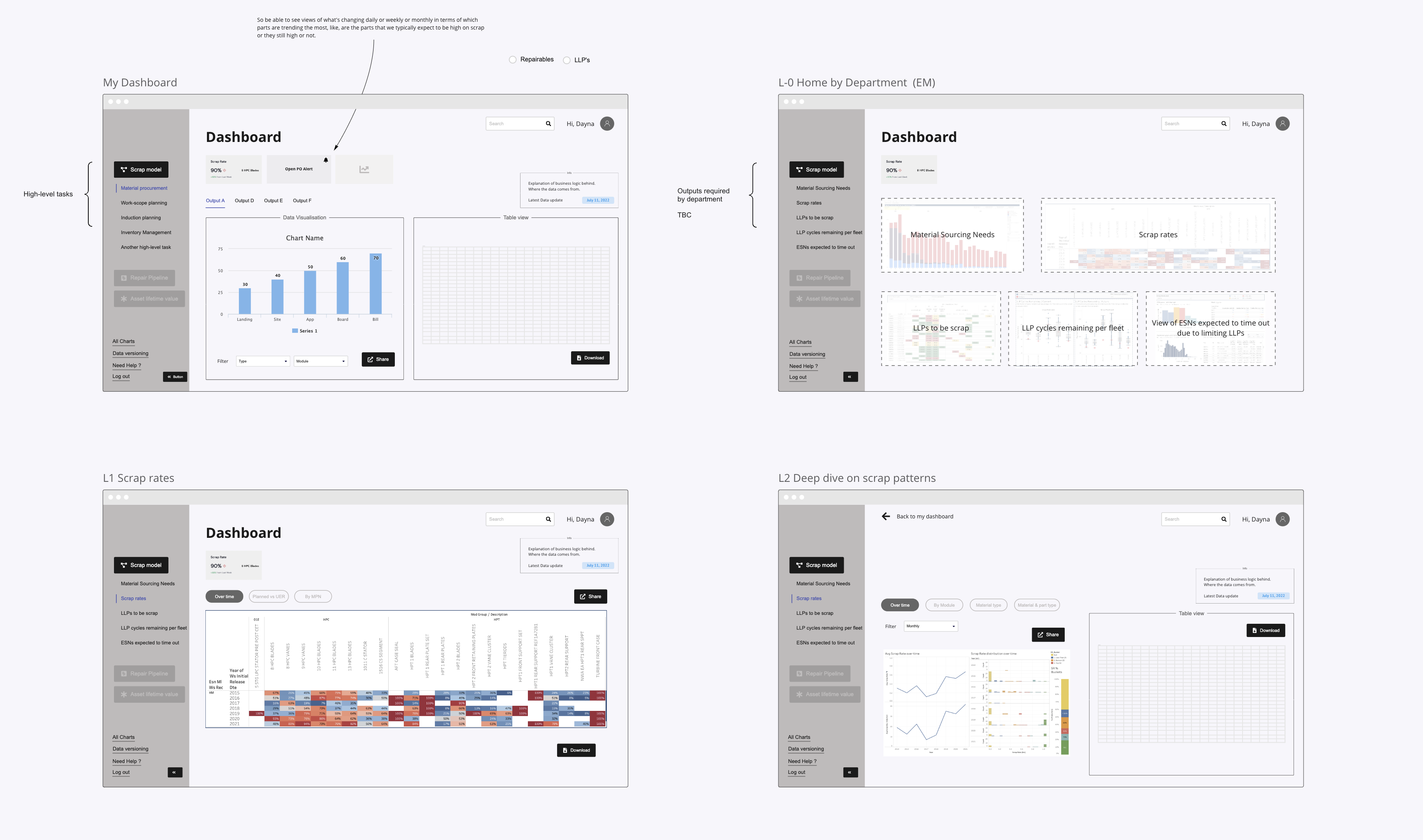
After reviewing the first interactive draft with users, it became clear that the prototype needed to be fully functional, using real data. Users wanted to experience how the dashboard truly worked — filtering, comparing, and analyzing information — not just see simulated interactions.
Recently acquired skills in low-coding development helped me to choose the right tool to deliver functional prototype in proposed timeframe.
It was agreed to use Webflow for the clickable prototype
Since I didn’t have access to the actual company data as an external contractor, I created a simulated database with identical data points and filled it into the prototype. This allowed users to interact with realistic data and better understand how the final dashboard would perform.
Next case
You'll want to see this
Designing Dott – a private app that makes memories unforgettable