
Web App MVP for a Beauty Shop
Sofie set out to bring consistency to the chaos of foundation shopping – a system that translates shades across brands so users can always find their perfect match, discover close duplicates, and compare prices in one place. As the concept evolved, the product expanded into colour cosmetics and video-led beauty shopping, while my role grew from UI designer to full product partner guiding UX, design systems, and documentation through each pivot.
MVP
Web App
B2C
E-commerce
Landing page
Sole Product Designer, collaborating directly with the CEO, developers, QA testers, and marketing team. Responsible for UX / UI design, prototyping, design system, usability testing, and documentation.
Sep 2020 – Jan 2022
The project began as a Toptal engagement to improve low-fidelity wireframes for a beauty product browser MVP.
My initial tasks were to:
What began as a small UI refinement grew into a full-scale product partnership that covered design, documentation, and testing across multiple rebuilds and pivots.
Together with the client, we:
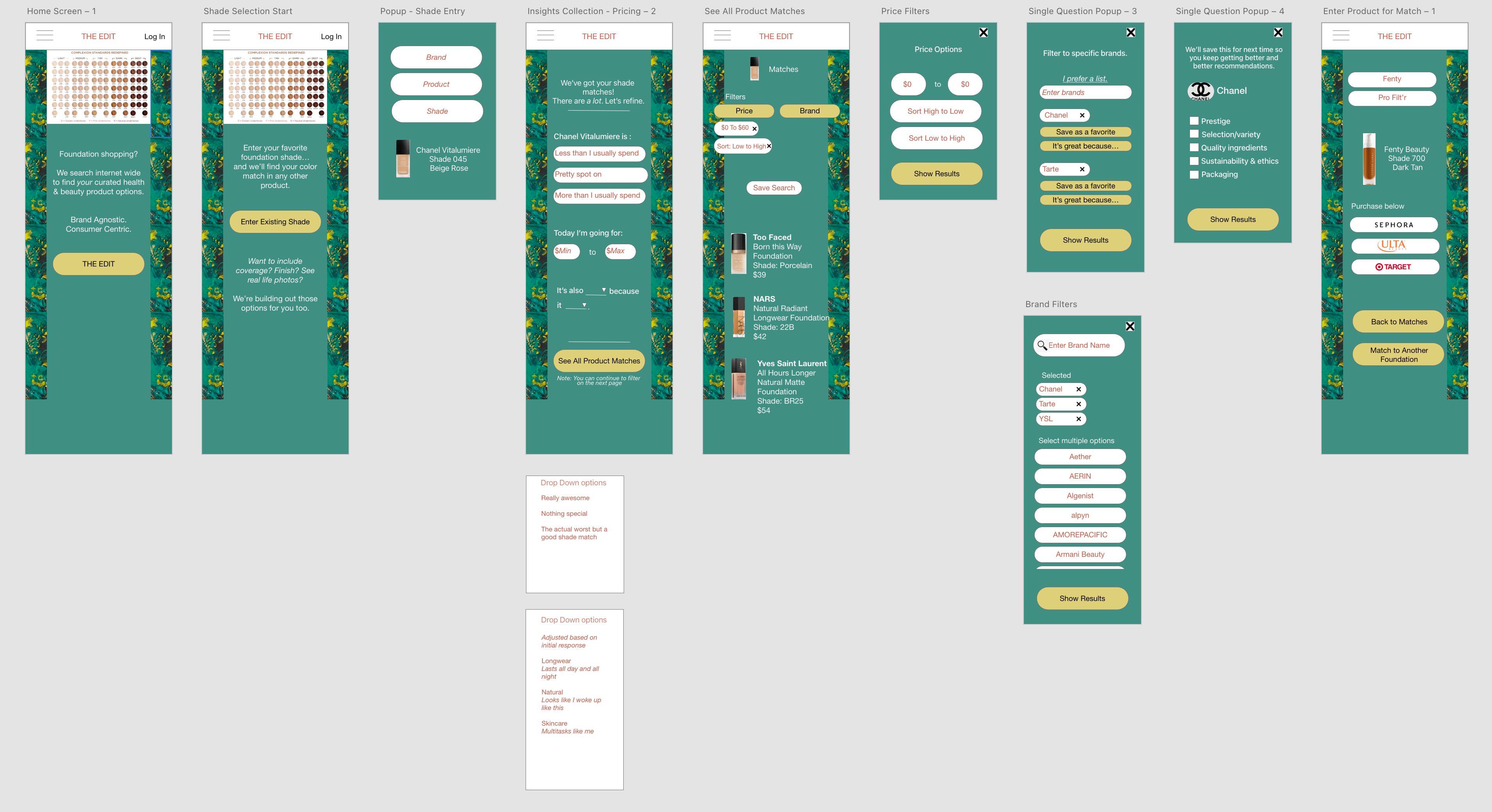
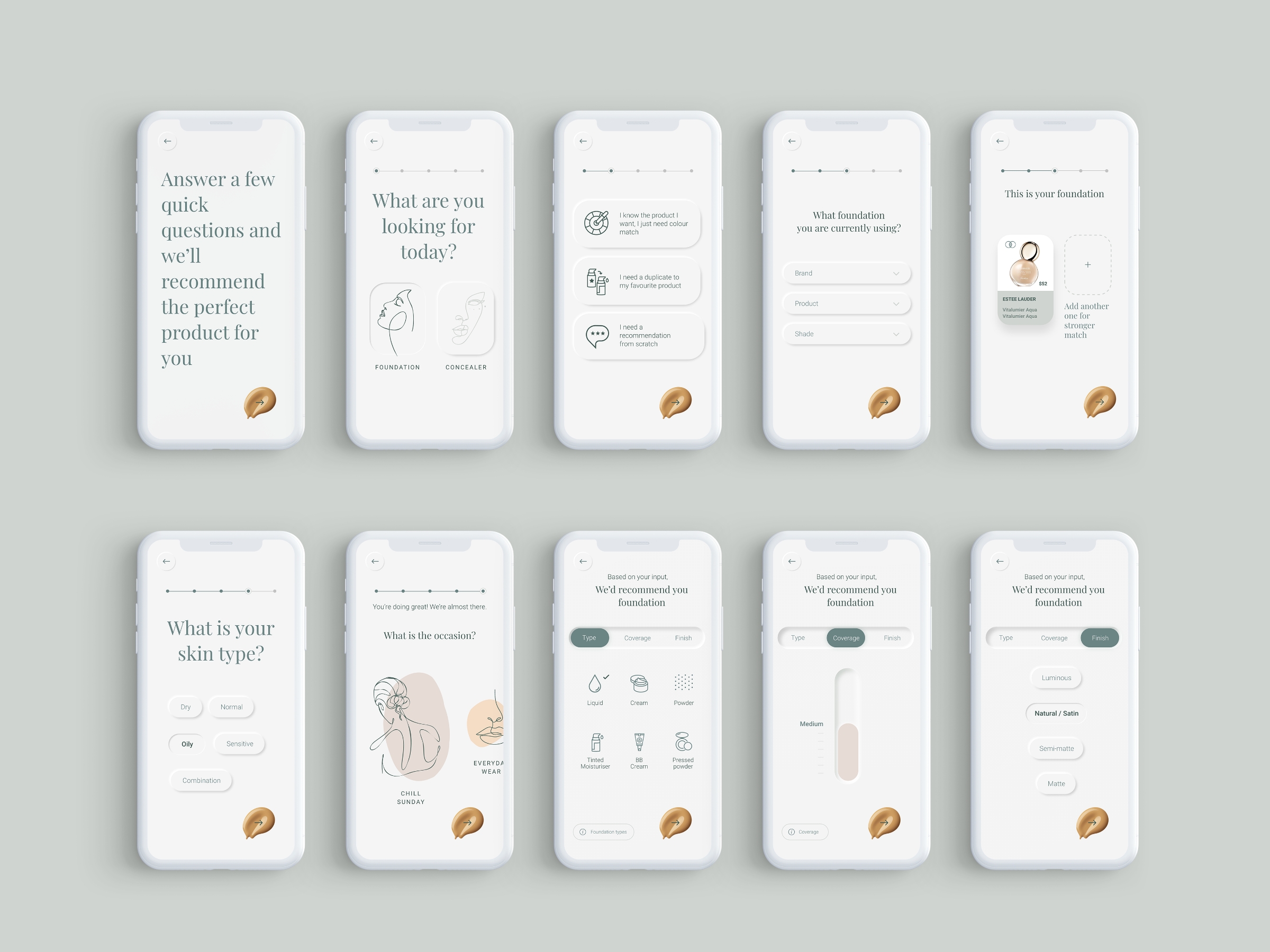
The final prototypes introduced key innovations such as a shade-matching algorithm, duplicate database, and universal checkout, merging content and commerce in one experience.
I stayed with the team until beta testing of the third version, ensuring design quality, testing consistency, and smooth handover to developers.
Although the product ultimately paused before a large-scale marketing launch, Sofie validated a strong user need for a trustworthy, centralised beauty shopping experience.
Online beauty shopping is fragmented and unreliable. Consumers struggle to match foundation shades because every brand uses a different colour system, while prices for identical products vary across retailers.
Sofie aimed to solve this by creating a brand-agnostic, data-driven foundation-matching platform that compared shades across brands, simplified product discovery, and built trust. Later phases expanded into colour cosmetics, Chrome extensions, and YouTube shopping integrations.

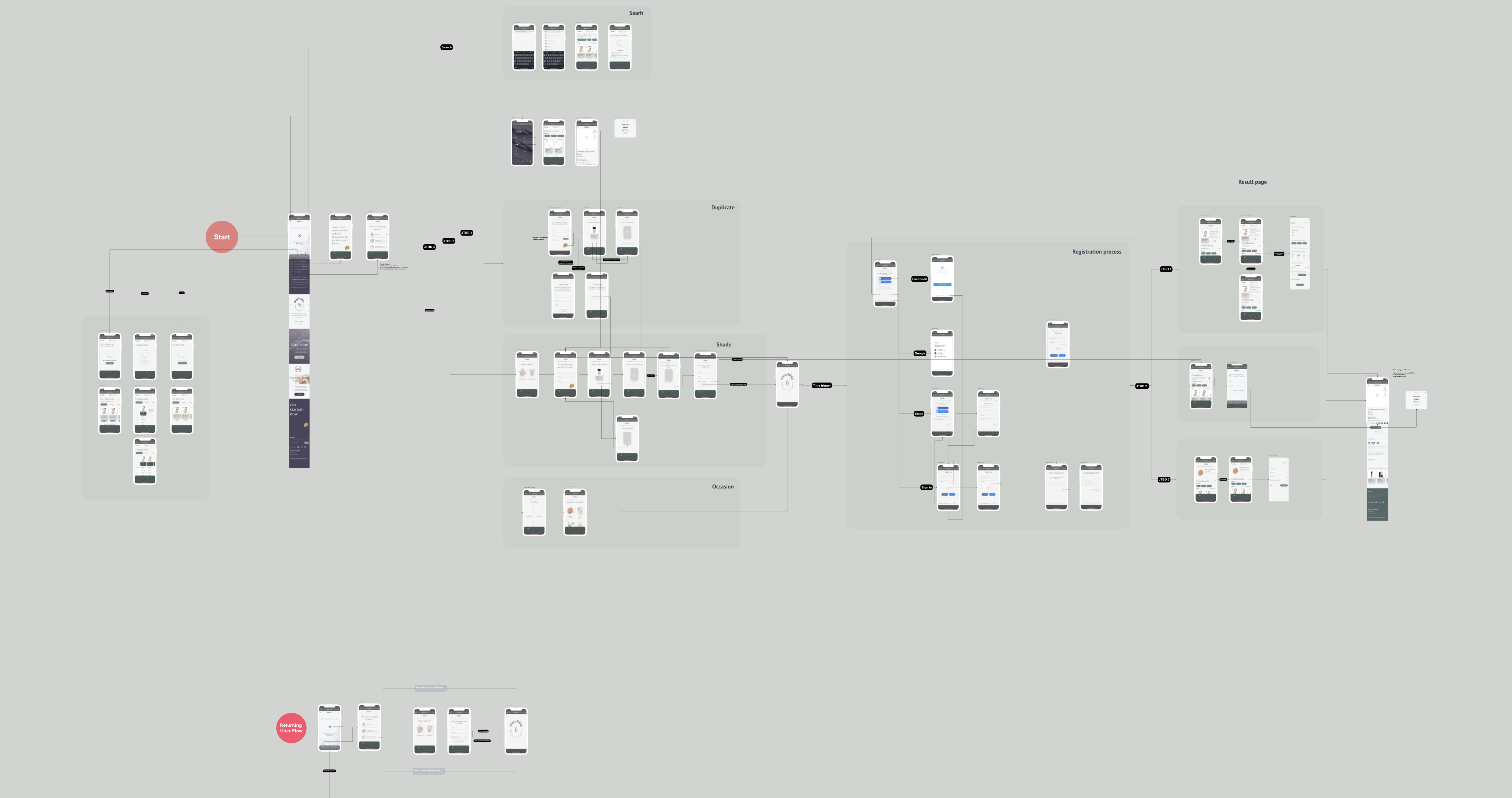
After quickly reviewing the flows and wireframes made by the client I saw room for improvement. To achieve the outlined goal I've proposed to follow the guidelines of the "Design Thinking" process. This methodology defines the following project phases: Empathize, Define, Ideate, Prototype and Test. When I started working on this project the client already finished Emphasize and Define stages.
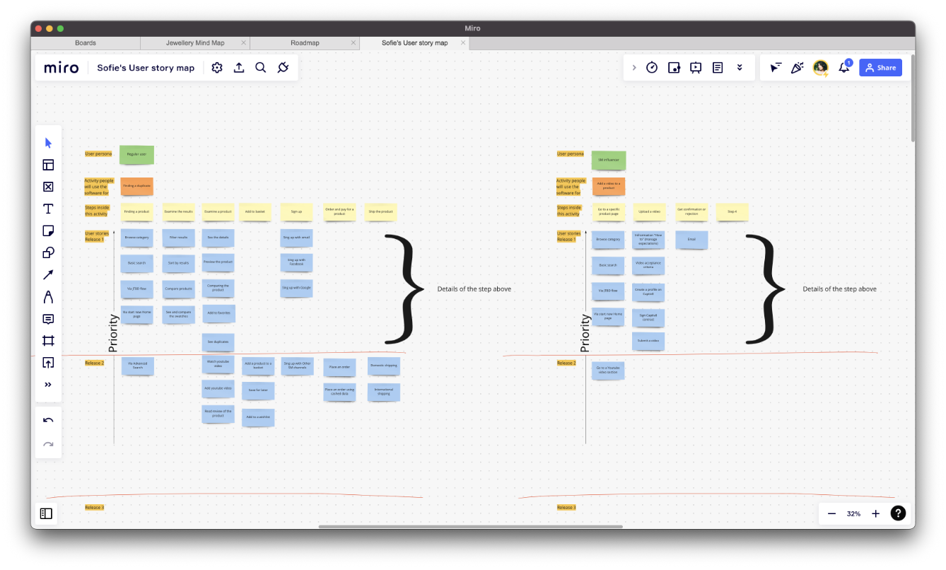
I began with a competitor analysis and created personas to clarify user needs. The client wanted to shape the product flows using the Jobs To Be Done framework – a methodology I hadn’t worked with before, but quickly learned and adapted into my design process. The insight was clear: users wanted reliability and simplicity in choosing the right foundation online. This informed the product’s focus on accuracy, price transparency, and personalised guidance.
I redesigned the client’s wireframes, refined the hierarchy and spacing, and created high-fidelity mockups and an interactive prototype in Adobe XD. This first prototype helped the founders present the concept and align around a clearer user journey. Evaluators tested it internally, and the client decided to move forward with development.

Feedback confirmed that users were eager to try a simplified skin-matching process, but also revealed opportunities to improve search behaviour, onboarding, and the mental model behind how the algorithm worked.
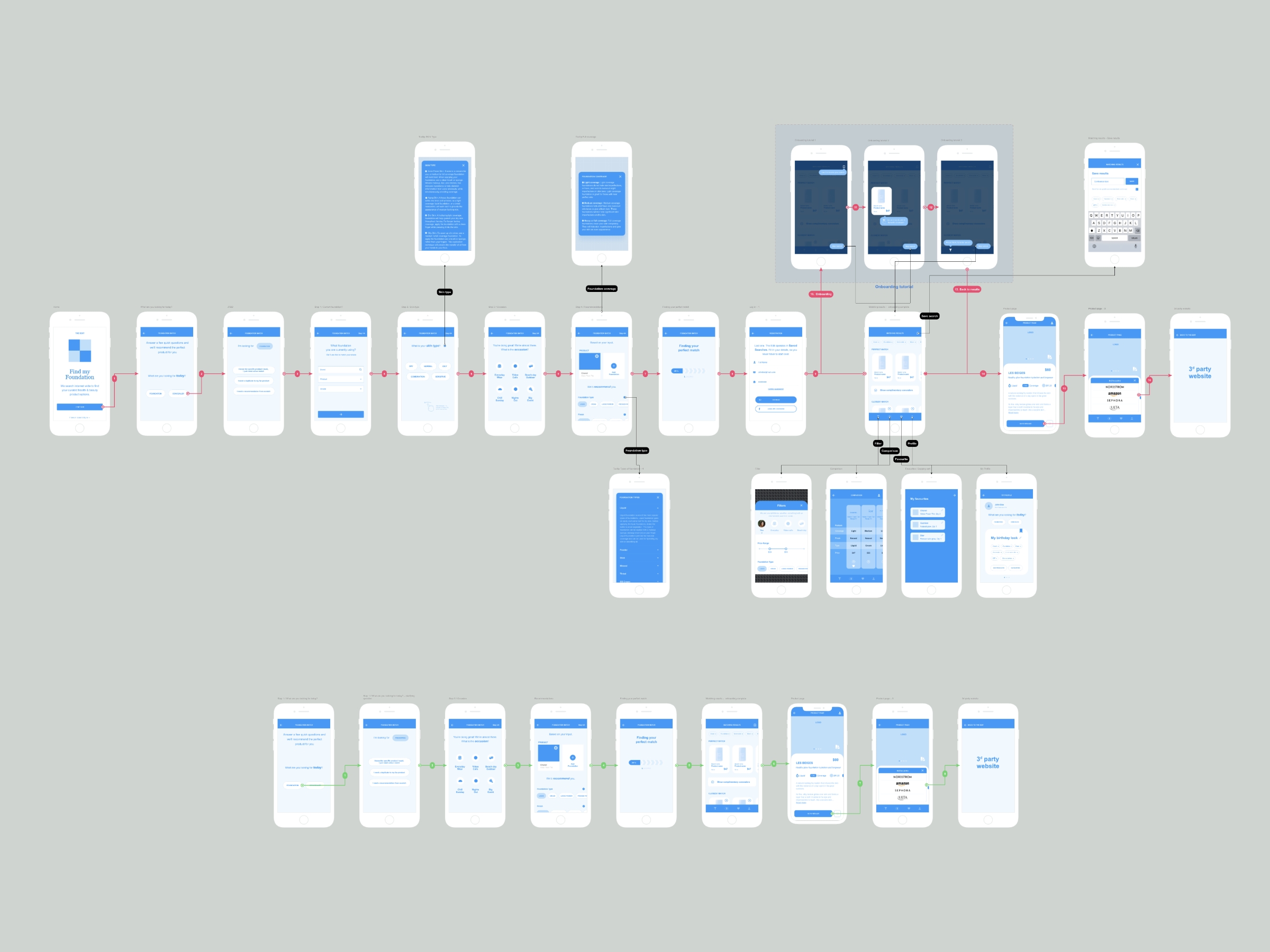
While Bubble was great for prototyping, it became difficult to manage more complex logic and scale the platform for future phases. We decided to rebuild Sofie in React to gain flexibility, faster performance, and control over the product’s growing features.
A new development team joined, and to bring them up to speed I created a comprehensive project Wiki in Atlassian. It documented every detail – interaction logic, search flows, responsiveness, component specs, and style guides – effectively serving as the product’s design source of truth.
This documentation saved weeks of onboarding and became the foundation for smooth QA and iteration cycles.
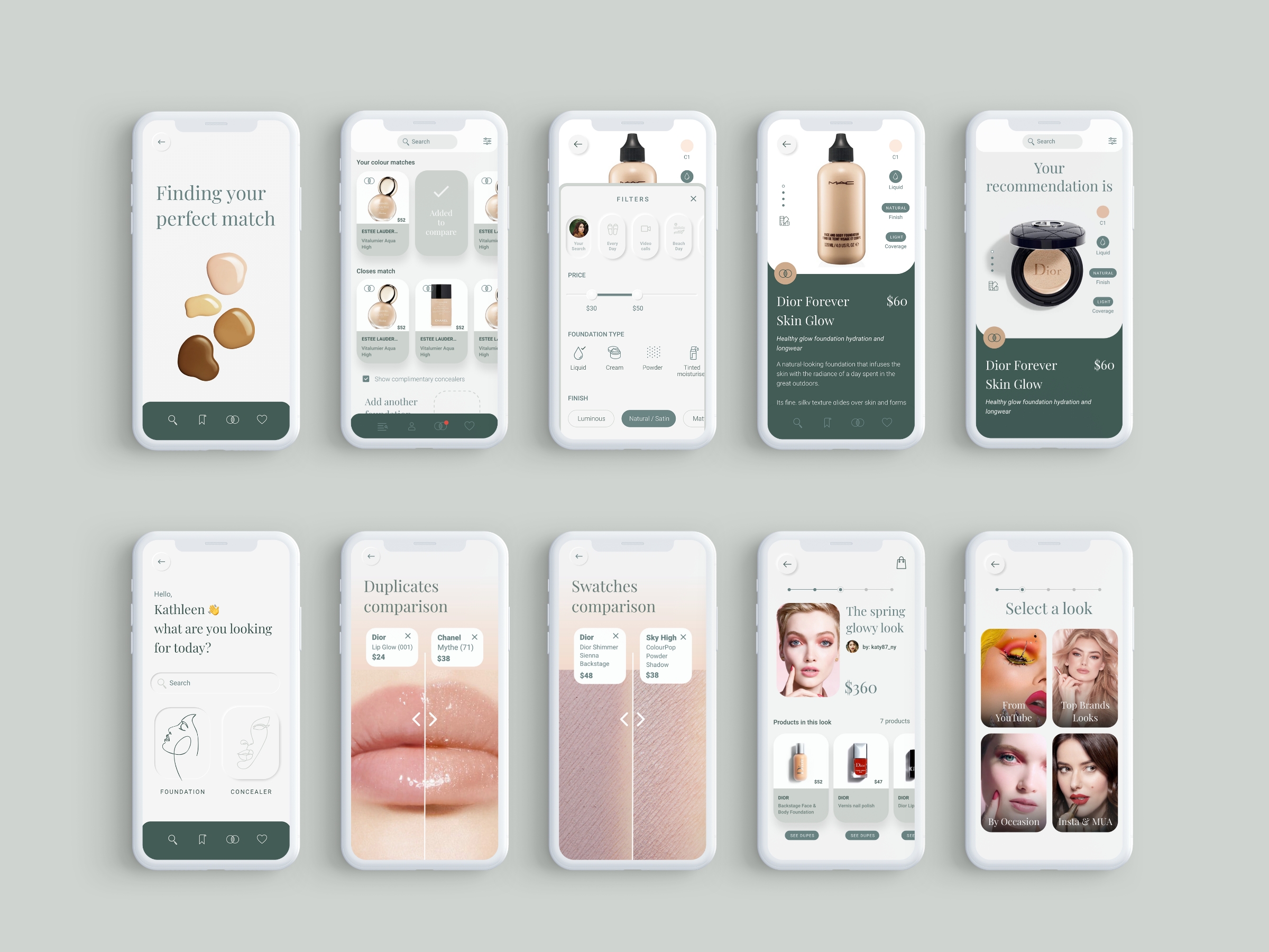
Once the foundation-matching MVP was stable, we expanded into Phase II, adding features such as a duplicates finder and swatch gallery for colour cosmetics. This evolution was partly driven by investor and accelerator pressure to show wider potential.
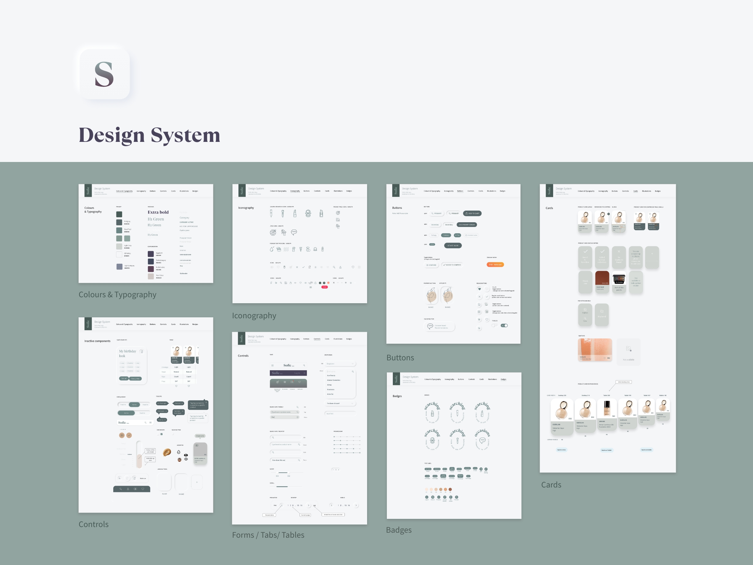
I refined the user flows, updated the design system, and ensured scalability in the UI to support new product categories. The design system – built in Adobe XD and documented in Atlassian — included components, states, and interaction rules that kept the product cohesive across rapid updates.
For the React prototype, I designed and ran a full remote usability test with ten participants using a professional testing platform. I prepared the screening questionnaire, tasks, and metrics (effectiveness, efficiency, satisfaction), and ran a pilot before the main study.
Participants matched our ideal customer profile and performed twelve tasks while thinking aloud.
The data revealed strong engagement and overall satisfaction. Based on insights, I:
These refinements directly improved completion rates and reduced confusion during testing.
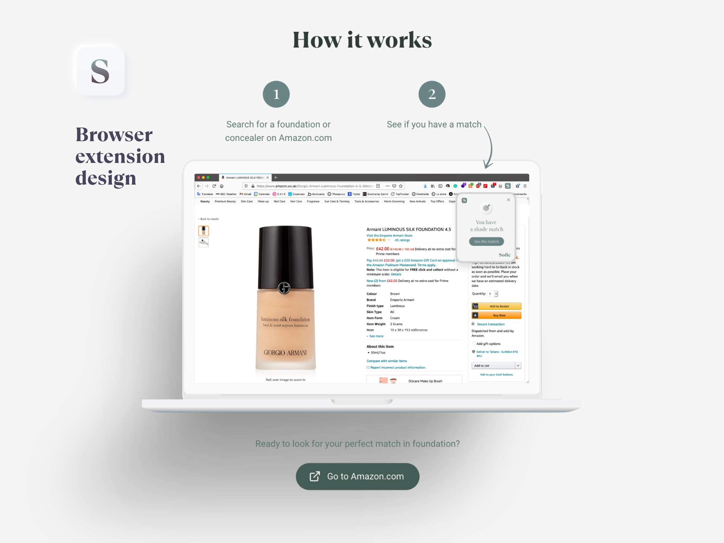
In the next phase, I designed a Chrome Extension for Amazon that allowed users to find product matches directly while browsing other sites.
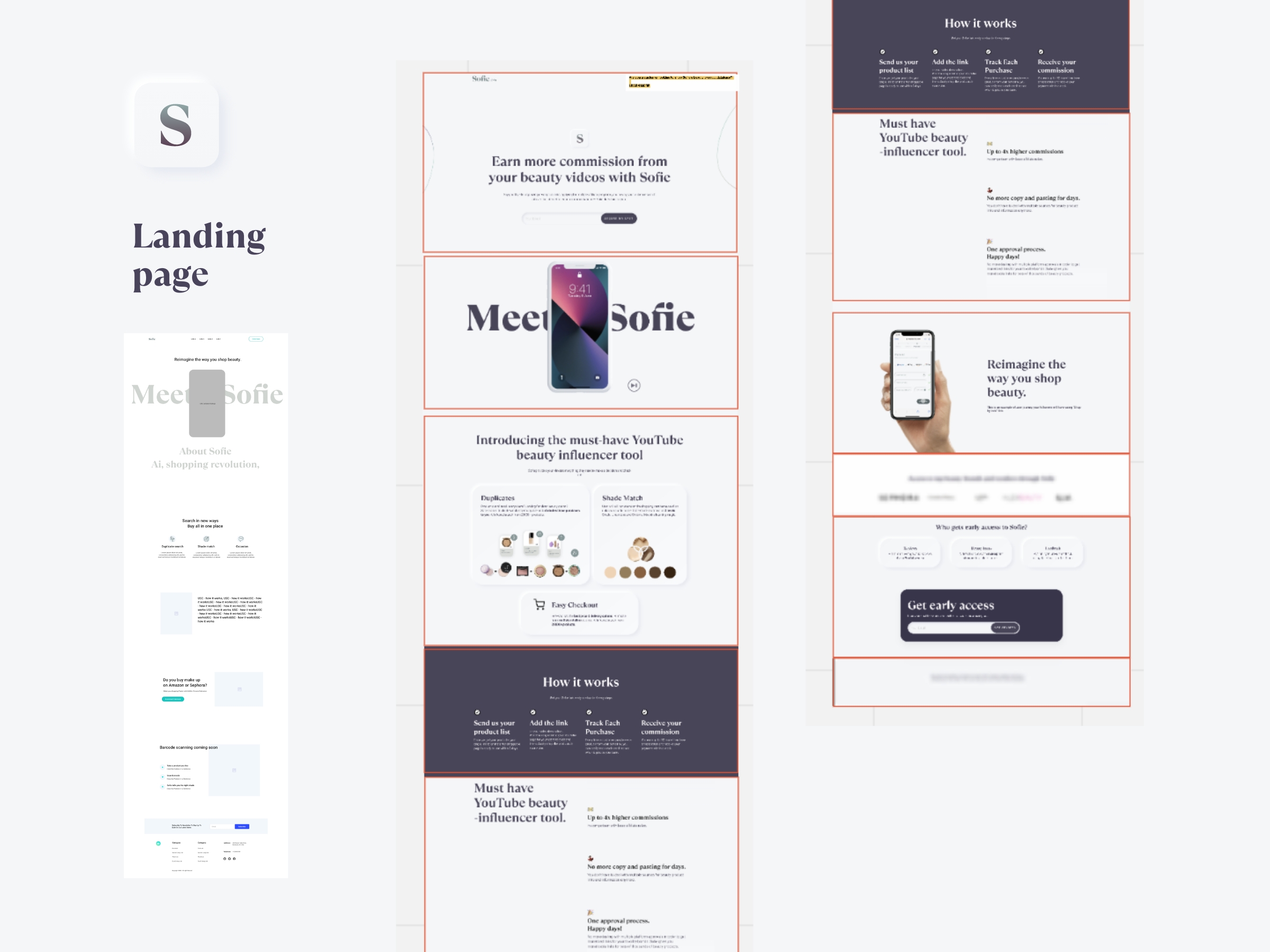
Later, the client decided to pivot toward the booming influencer market, introducing a YouTube Extension where users could watch and shop beauty videos in one place.
I created a functional prototype in Webflow to demonstrate the new direction, incorporating a shade-matching algorithm, duplicate database, and universal checkout — merging product content and commerce seamlessly in one interface.
Throughout all iterations, collaboration was key. I designed interactive examples to show how filters, search, and responsiveness should behave, annotated every flow for the development team, and worked closely with QA to ensure design fidelity.
We communicated daily via Slack, held weekly review sessions, and tracked progress through Atlassian Confluence and Jira.
I also supported the marketing and investor side, designing pitch-deck visuals and three versions of the landing page.
Next case
You'll want to see this
Health App for Internet Gaming Disorder.