
Website Evaluation and Redesign
This project involved a full UX evaluation and redesign of the Six Senses desktop website to address usability issues, structural complexity and a lack of transparency in the booking flow. With the brand preparing significant expansion, the goal was to create a clearer, scalable and user-centred experience that supported direct bookings, simplified navigation, and laid the groundwork for a mobile-first platform.
E-commerce
B2C
UX Audit
Usability Testing

Lead UX researcher and designer responsible for evaluation, IA redesign, user journey restructuring, interaction design and prototyping. Worked independently, supported by background insights from previous collaboration with Six Senses via John Henry design studio.
2017 – 2017
Identify critical usability problems within the existing Six Senses website and redesign the overall user experience to improve booking efficiency, information clarity, and site scalability while better supporting the needs of luxury travellers.
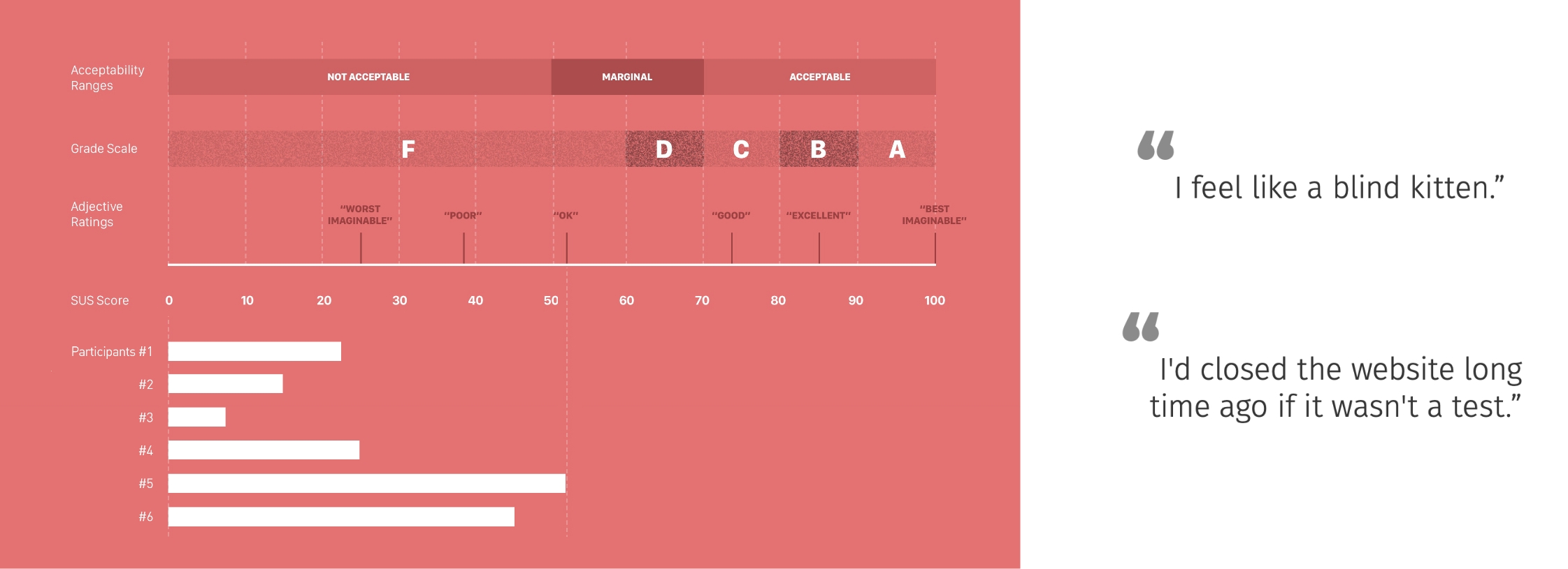
The redesign introduced a new information architecture, transparent pricing model, simplified user journeys and a microsite strategy scalable to the brand’s rapid growth. Key outcomes included a streamlined booking flow, clear currency and cost visibility, refined navigation, and dedicated pathways for core user intents. Deliverables included a full usability evaluation, redesigned IA, personas, task analysis, high-fidelity mock-ups and an interactive prototype. Testing highlighted severe issues in the original experience (SUS score 27.92; 36% unassisted task completion), validating the impact and necessity of the redesign.
The original website presented users with overwhelming navigation, inconsistent menus, unclear hierarchy and no transparent pricing, leading to frustration during booking and difficulty finding key information. The complexity of the mega-site structure also made content maintenance challenging as the brand prepared to scale. Users lacked confidence in the booking process, struggled to locate services such as SPA treatments, and frequently abandoned tasks due to unclear labels, information overload and poor feedback.
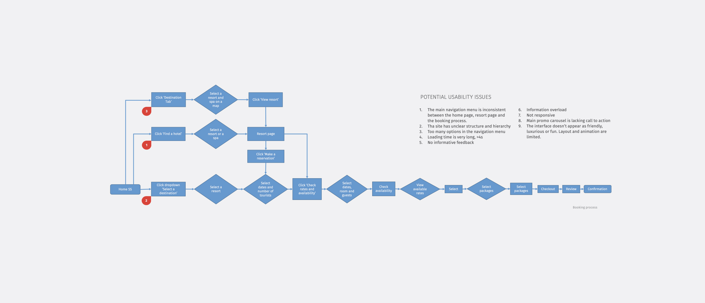
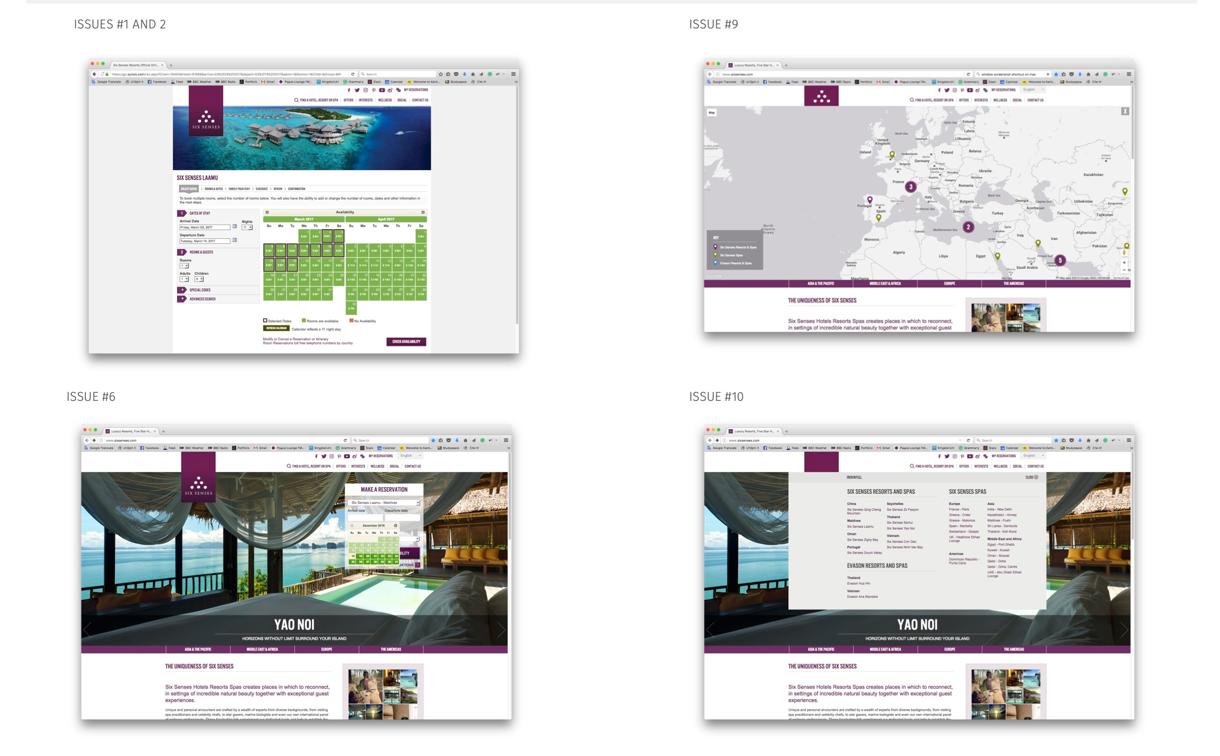
I began by immersing myself in the existing Six Senses website and retracing the booking flow as a guest. The experience quickly revealed structural fragmentation, inconsistent menus and unclear hierarchy.
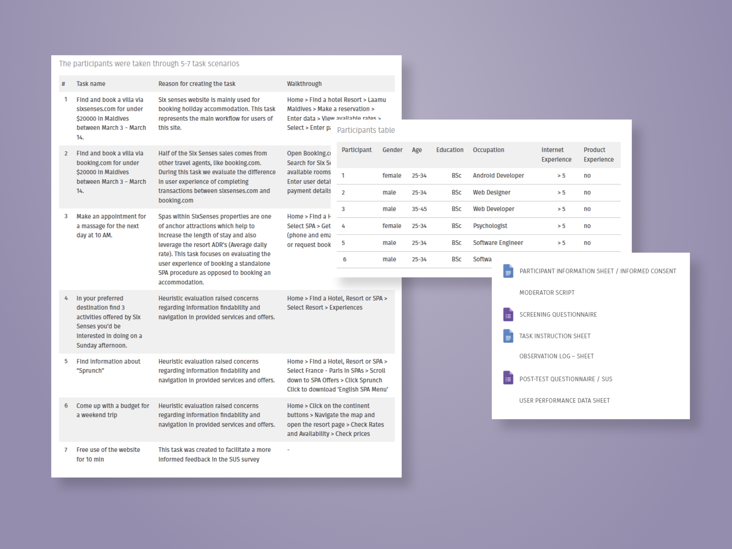
To validate these early impressions, I conducted remote moderated usability testing with six participants. By the second task, most users were visibly stressed or confused — several described the booking experience as “a quest”.
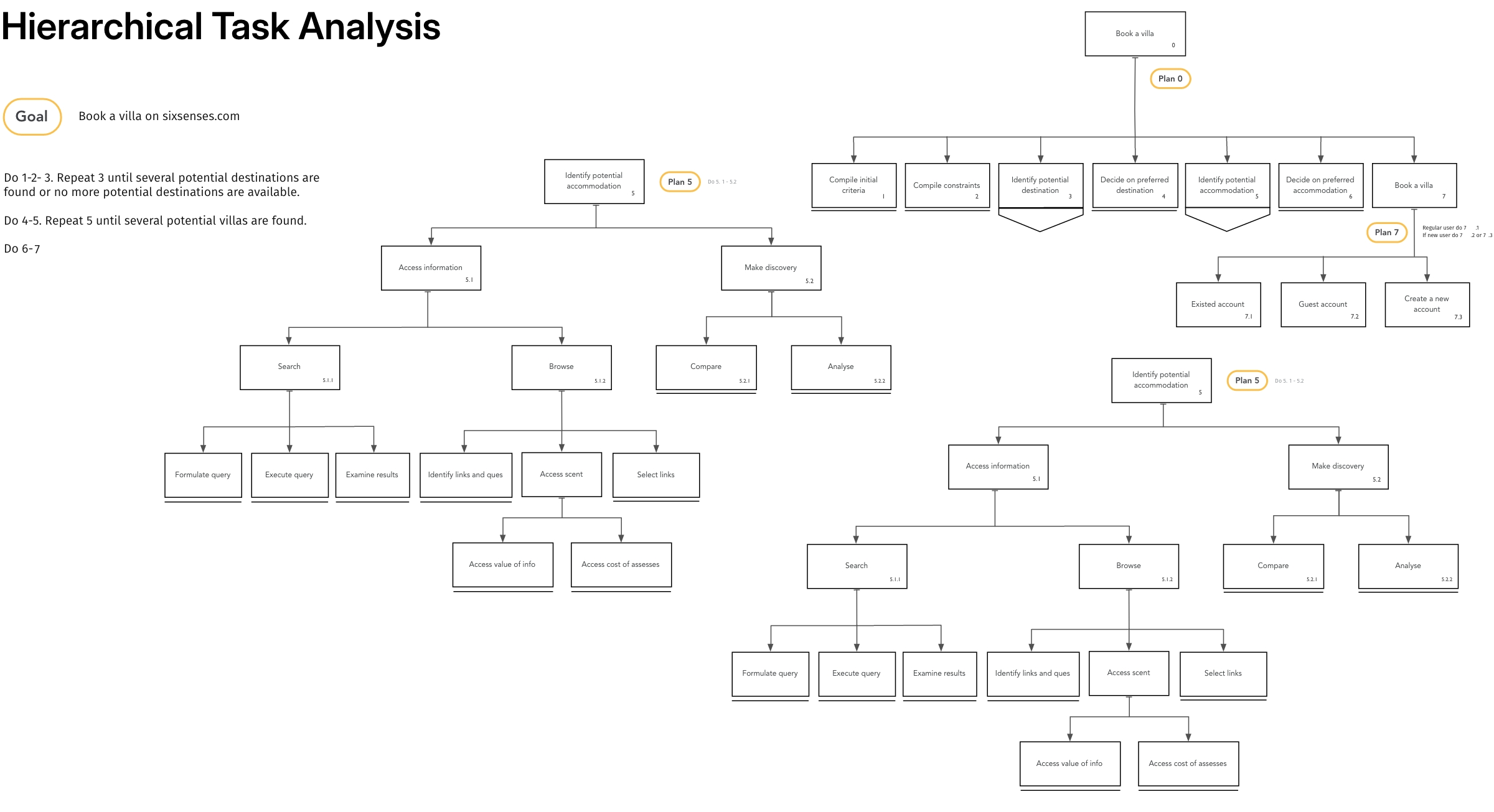
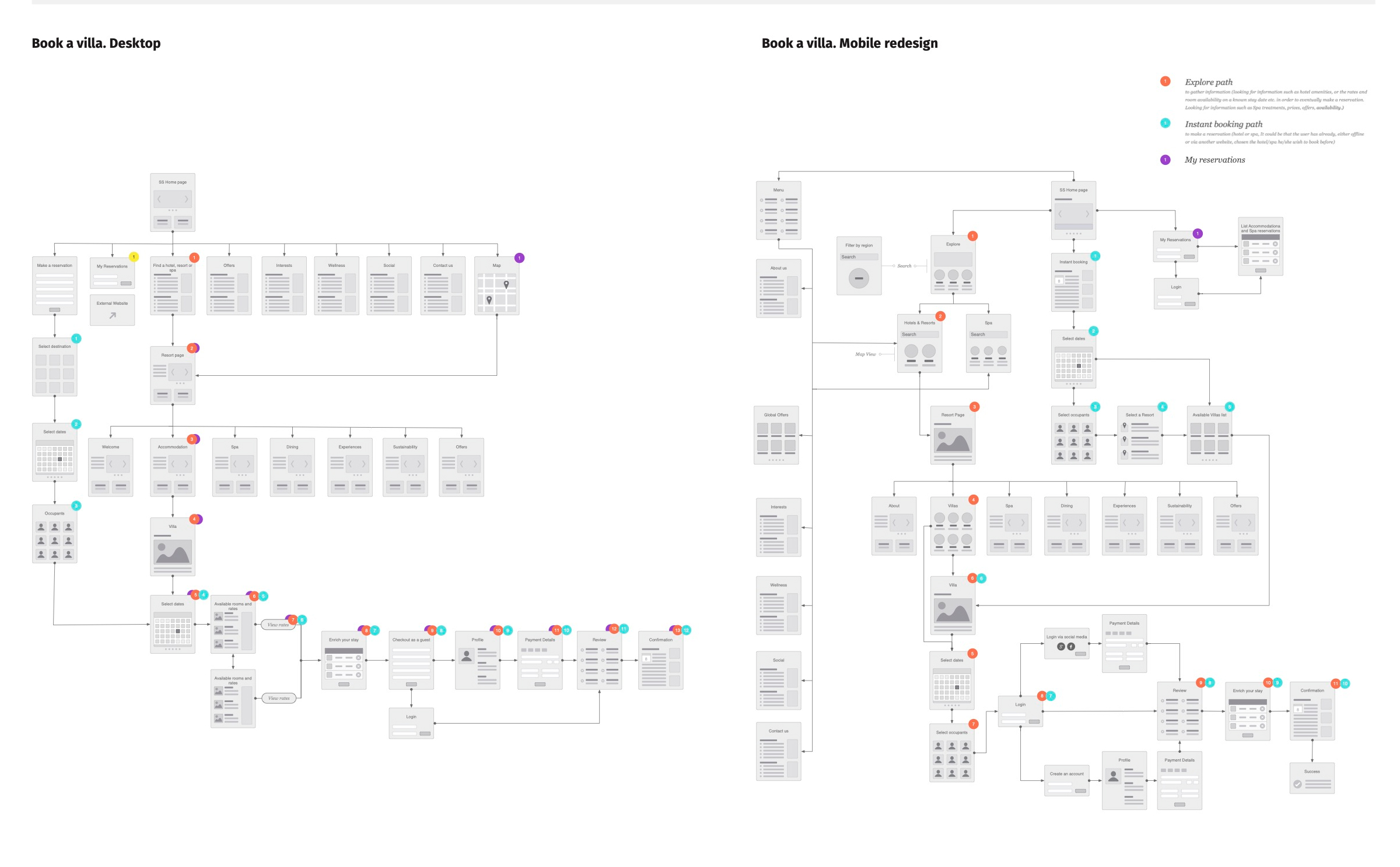
To map how much cognitive effort the site demanded, I created a Hierarchical Task Analysis for booking a villa. The diagram exposed the depth and repetition required to move forward, making the structural problems unmistakable.
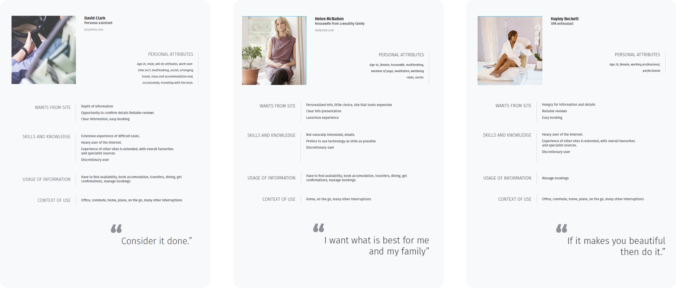
Next, I developed personas based on user behaviour, Six Senses’ demographic insights and the patterns observed in testing. These represented the brand’s core audience: high-income travellers, personal assistants, SPA enthusiasts and guests seeking premium service with minimal friction.
Their expectations were unmistakable — clarity, confidence, and effortless booking.
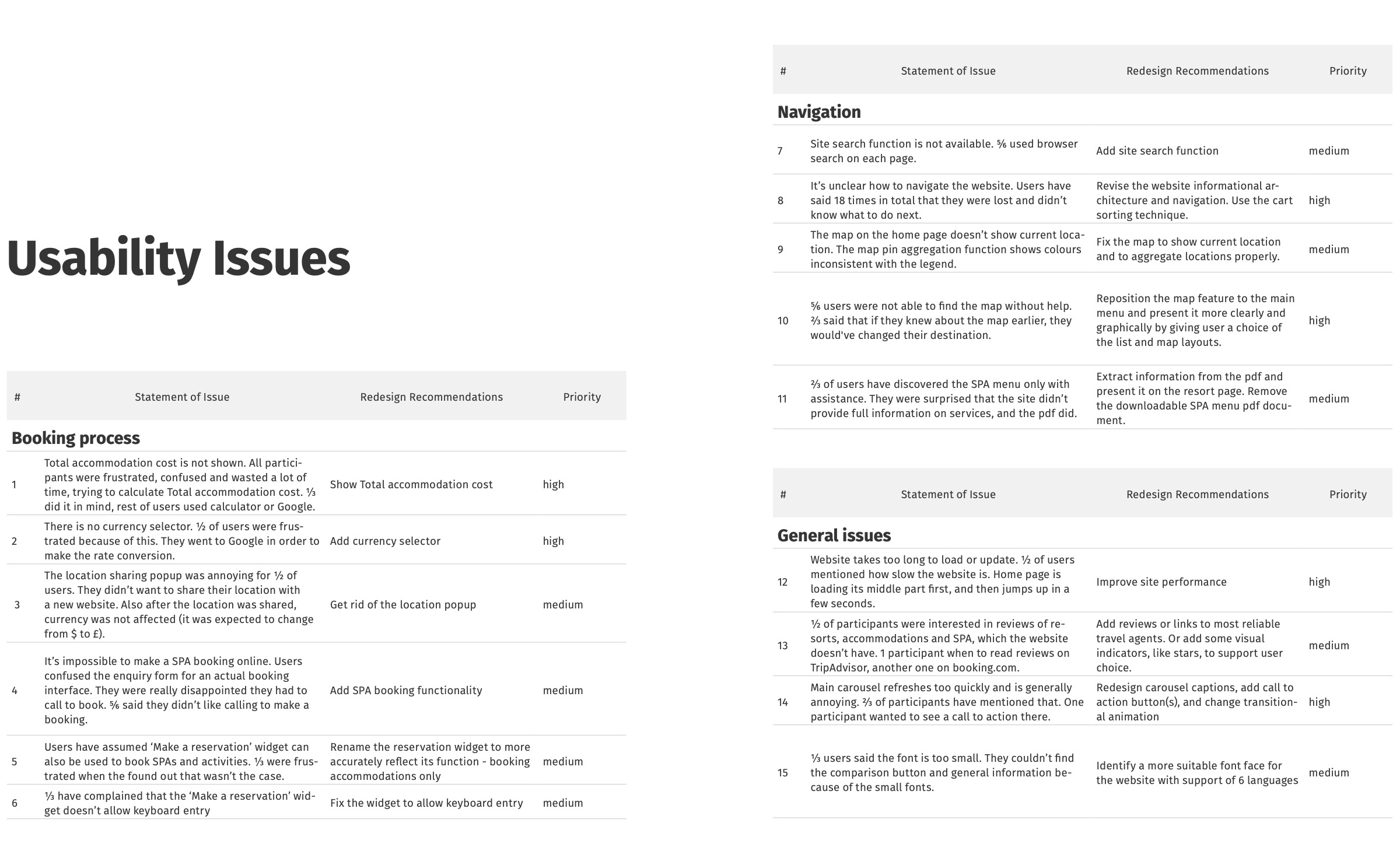
With testing results and personas aligned, a clear set of issues emerged:
– Users lacked a clear starting point
– Navigation shifted unpredictably between pages
– Prices were scattered, hidden or incomplete
– Critical content (like SPA menus) was buried inside PDFs
– “Make a reservation” looked like it could book anything — but only handled accommodation
– No currency selector for international guests
– Total booking cost was never visible
– The SPA journey forced users to call, causing frustration and abandonment
The redesign recommendations became a blueprint for rebuilding trust.
The site behaved like a mega-site — deep, overloaded and difficult to maintain. The solution was to break it into a family of microsites. Each resort became its own experience with a consistent design system and clear navigation, while still remaining part of the Six Senses ecosystem.
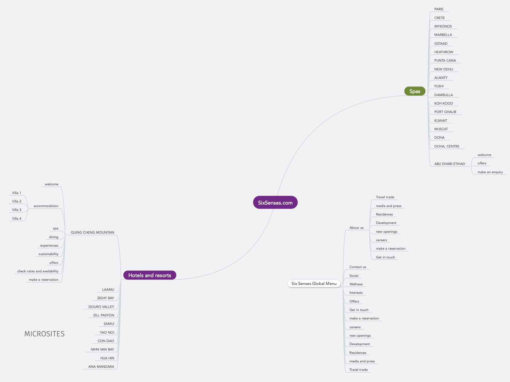
This shift solved both business and user problems:
– It gave clarity to travellers
– It reduced content overload
– It supported the company’s upcoming expansion to dozens of new properties
– It allowed local teams to manage their own content without impacting the global site
The homepage was redesigned around three clear user intents:
Each path now offered structure instead of uncertainty.
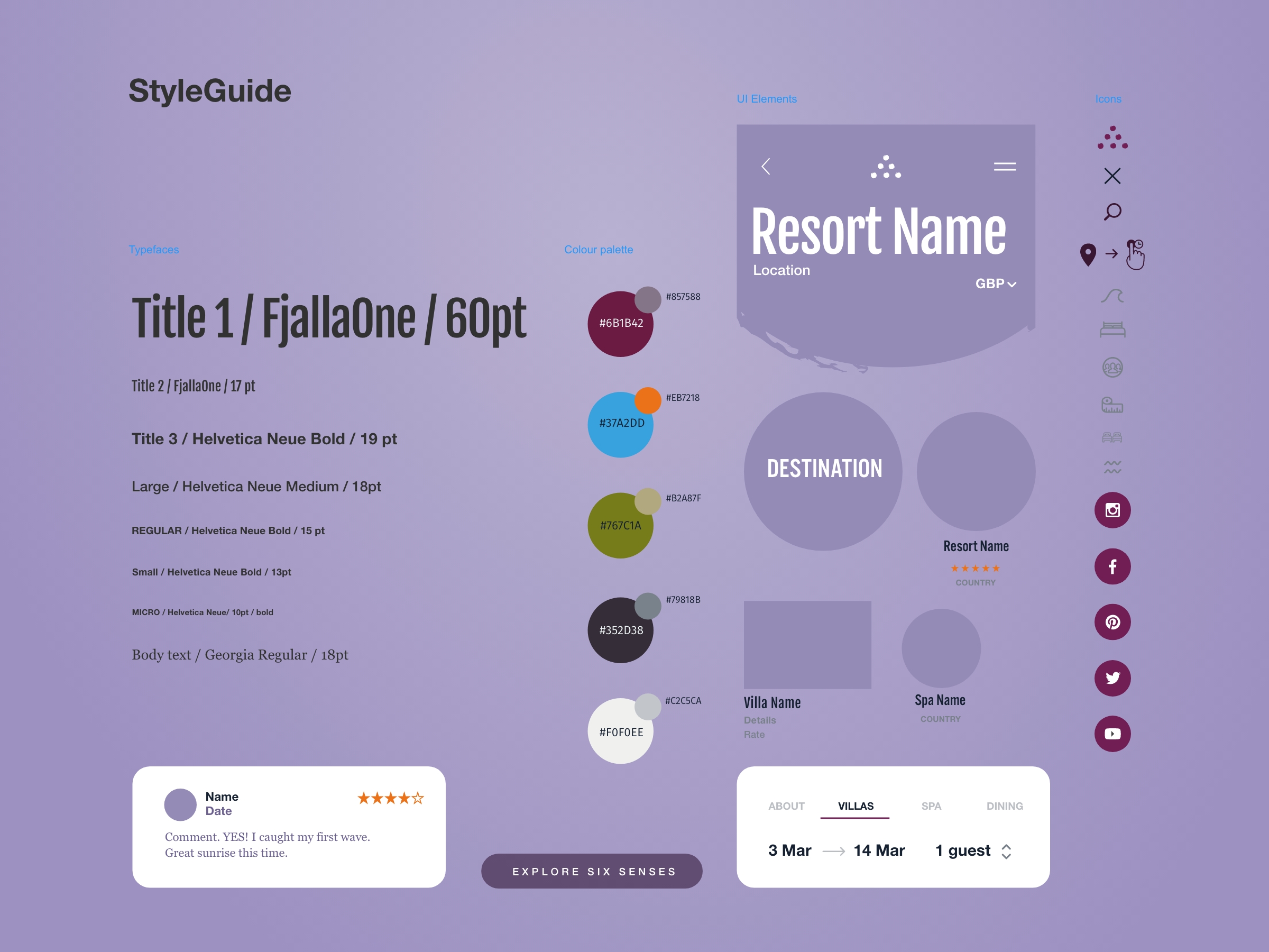
I developed a cohesive styleguide that unified typography, colours, spacing, and components across all microsites. This ensured scalability and consistency across future properties.
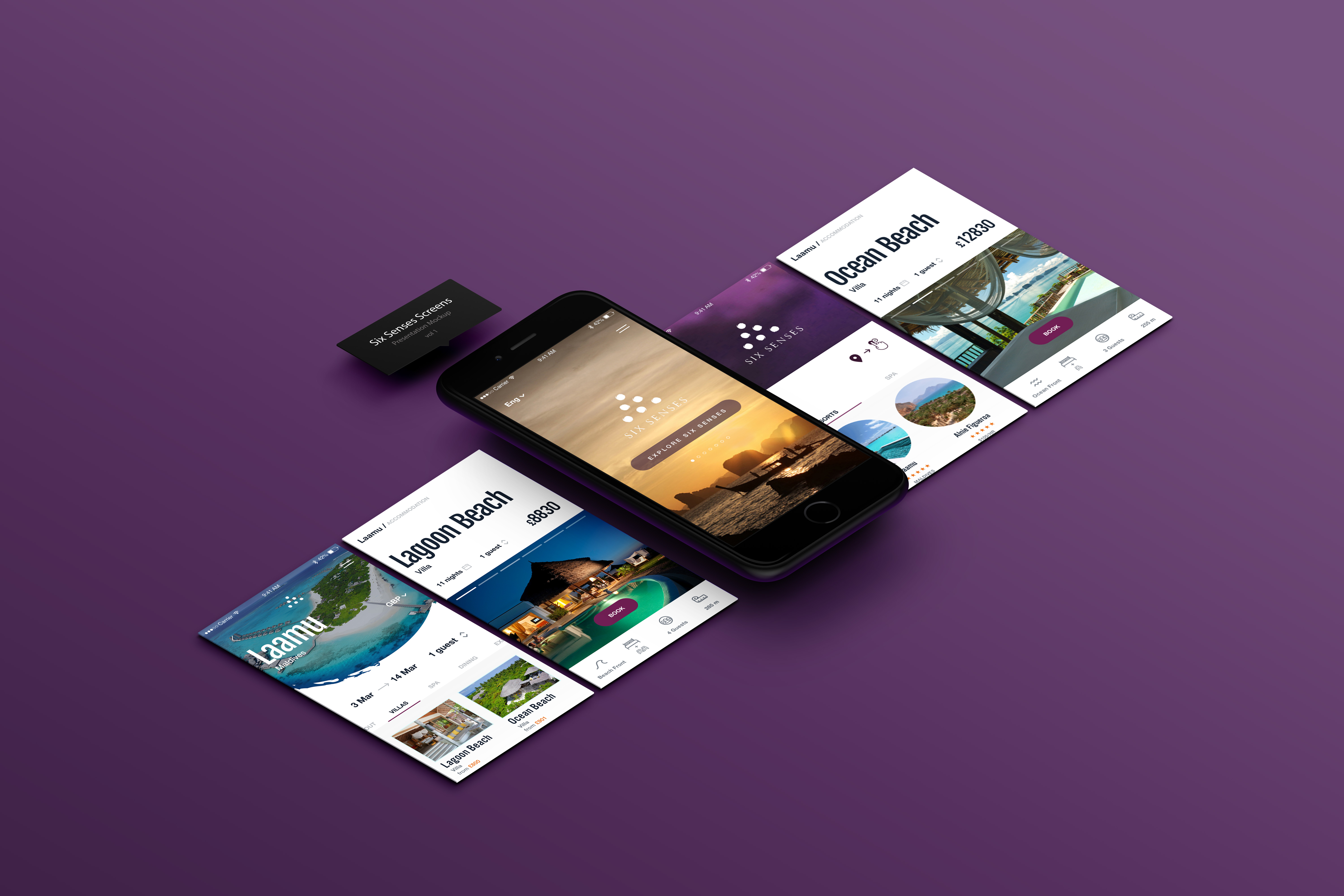
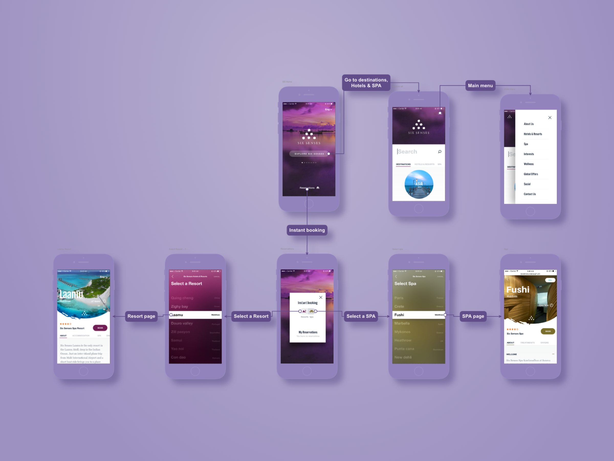
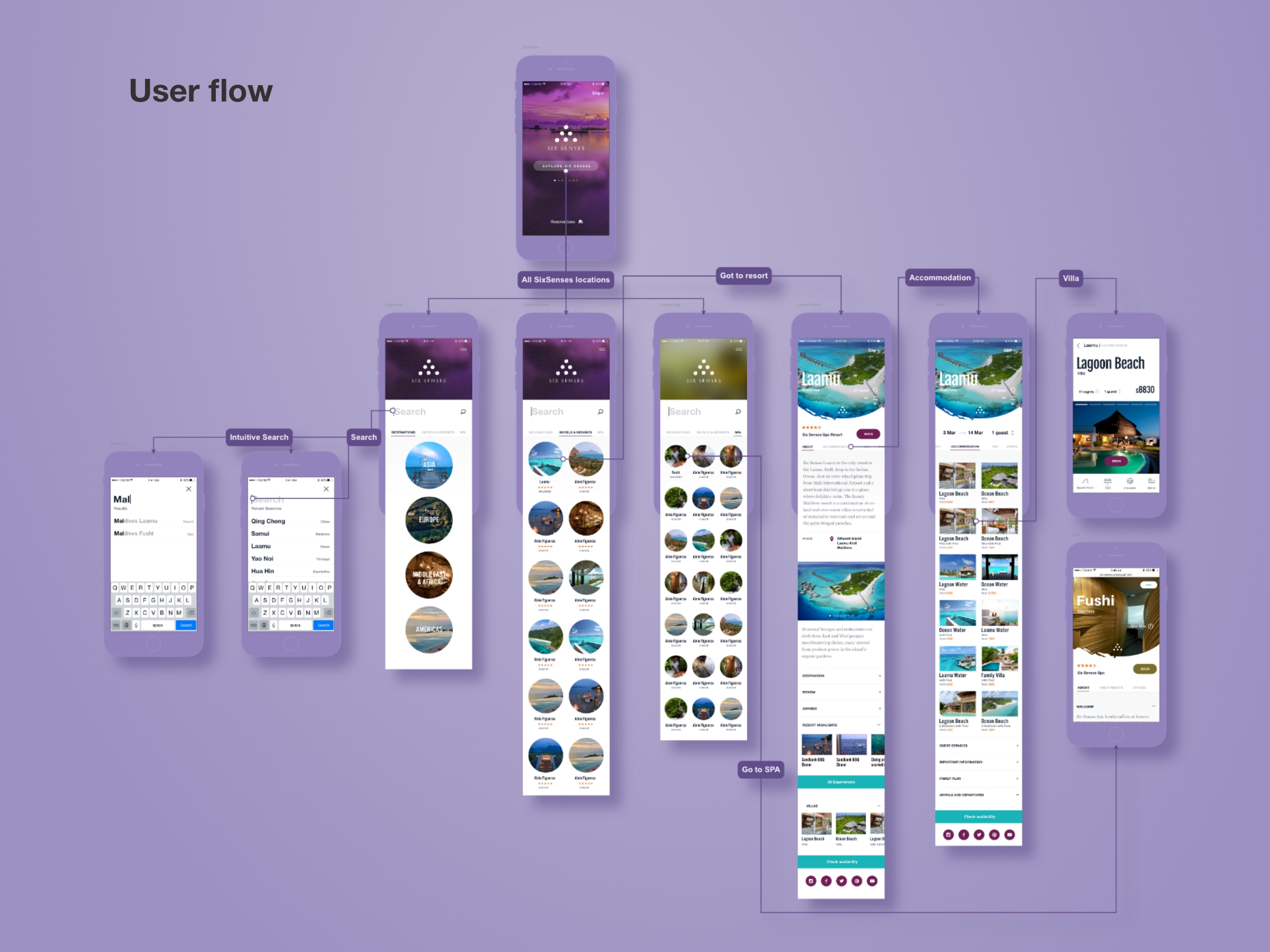
I developed a high-fidelity prototype that brought the full redesign to life — from navigation to villa browsing to booking. Early feedback confirmed the improved clarity and usability.
Next case
You'll want to see this

Functional Prototype of an Analytical Platform for an Airline